CHARGE UP
YOUR LIFE
Recharge Your Ride — and Your Day
The POWERED BY E.ON + Clever website features an engaging animated video that creatively showcases the time spent recharging an electric vehicle as an opportunity for personal activities, turning each recharge into a moment of life's little pleasures.
It's a
Lifestyle
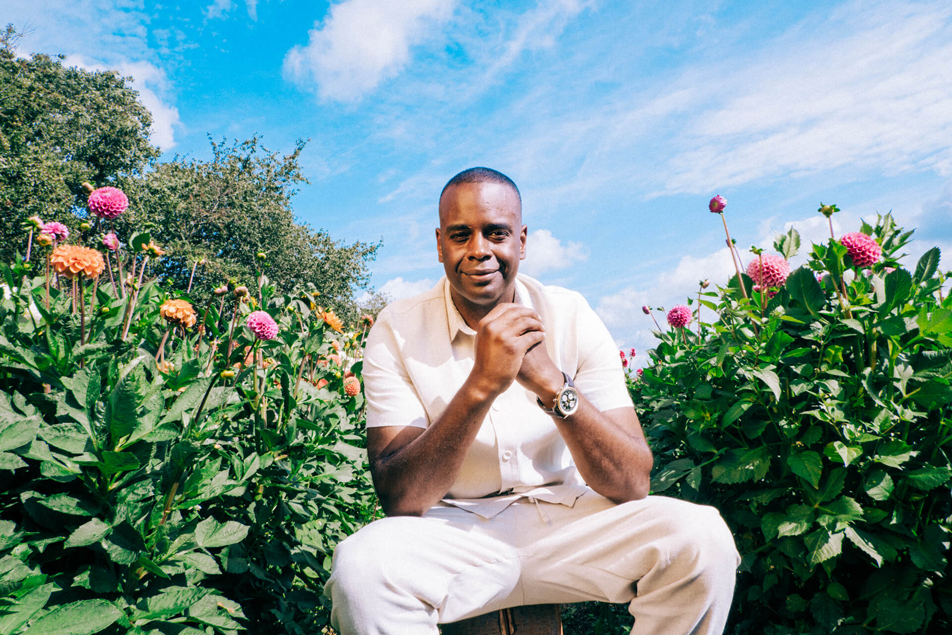
We have produces a series of charging station "beauty shots" for the brand's social media profile that highlight the sleek, modern design of the stations as well as the often picturesque location of the stations. These images enhance an association with both efficiency and eco-consciousness as values inherent to the Powered By brand and its customers.
Freedom, Recharge, Adventure, Greener Cleaner Journeys, Sustainability, Empowerment, Exploration, Convenience
With this creative concept and production, Neobotanik has created a new road forward for Powered By. It's one that will help the brand continue to build a social media community around its eco ethos and adventurous spirit.
Whether it's building websites or branding whole worlds, Neobotanik will help create whatever elements are needed to take ideas from seed to flourishing stem.
Neobotanik is bringing brands into full bloom.
Plant a seed
Leave a message and we'll get back to you as soon as possible.
Can't wait?
Book a virtual meeting with our head gardener, Senai.