
It started in 2010 when Responsive Web Design (RWD) approached the World Wide Web. Its aim to carve websites and provide a mobility solution became a hot topic in 2013. 2014 is the time where many businesses are gone mobile or putting RWD to action.
I would like to talk about responsive web design behaviour and user experiences where about 50% of customers move to the competitor’s website after a bad mobile site experience. The challenge for digital companies is eventually growing with unlimited choice of devices and thousands of screen sizes available in the market. So the question is not “why go responsive?”, but when?
RWD allows businesses to optimise, keep uniformity and usability for large desktop, laptop, tablet and mobile presence using single form of web development and not developing three or more different sets of codes for desktop, tablet and mobile. This brings a vital consideration for businesses for long term stability of their web presence. In this stimulating and competitive digital world, it is important to always be one step ahead to keep up. Most of the customers want to buy the product or service if the site has great user experience on the devices they are comfortable using. It can be a mobile, a tablet, a laptop or a desktop.
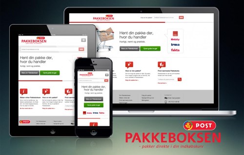
We at DNA-Design design and develop as per our client’s requirements. We have been busy driving ourselves through Pakkeboksen, Super Brugsen tilbudsavis, Hagelund + Jensen, Homes & Housing, Fakta.eu and many more.
It is important to keep following key areas in consideration before adapting RWD. We’d like to recommend the following when going mobile.
1. Facts awareness for a responsive website
You must be aware of the size and the complexity of the whole process. It is important to understand the cost involved and ensure the complete process of your requirement to our design, development and marketing. It is also required to set a budget for transforming your business responsive, certainly there are real return of investments involved. These will tend to be long term benefits through scalability and the maintenance of one code base rather than three. The scoping and development of responsive website is an elaborate undertaking and not to be underestimated.
Hire the right team to vitalise your website’s success. A user experience (UX) designer knows the distinctions of all devices is a must have as is the inclusion of capable engineers with experience across a range of screen sizes.
Driving with the right plan with save you from a lot of hassles in the future. So don’t judge the cost by cutting corners as it may save you some money now but will cost you way lot more as your business expands with your website.
2. Build a website with attitude
The key to your success is to keep the right content on your website. You need to know your content and create a strategy in such a way that the customers know who you are as a company and what you can offer them.
The right form of content will help defining the grid, system layout, navigation design and scalability of your website. Keep the content precise because, by experience, if it take more than 5 seconds to load a page on mobile, the customer will leave your website. Not everyone is on 4G or even 3G network.
The content strategy was one of the most challenging parts of Pakkeboksen with considering thousands of users accessing the website across the country.
3. Art of context
Your website is the voice of your business. You should understand the flow of context that will drive your customers throughout the website. If someone is viewing your website on the move while sitting in a car, a bus or a train, they will mostly view it on a mobile. Whereas, users will view it on tablets while watching television, will have diverse need and intention from those viewing on a desktop or laptop.
Think about that moment of a day, the impacts, create user stories from your experience and your business, and provide context-sensitive interactions for users on a touchscreen device.
The context of Homes & Housing was created by us in 2013 with that approach which provided the users to navigate the website through regional and international languages to express and fulfil the viewer’s needs. The site incorporates the need of stakeholders and consumers. This site gives adequate information to both users.
Every user situations are taken into consideration, where the customers need to find your business information or your address on the go using their phone. Hence, in addition, a Google map to locate the business address attracted a lot of users with trust.
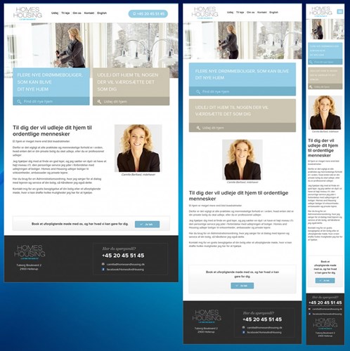
Optimising the site for tablet view was taken on a long term goal considering fast growth of adoption of tablet devices.
4. Mobile viewers
Designing the website for the smallest screen size along with desktop and tablet screen sizes is delivered to focus on growth of accessing your website anytime anywhere to scale up your business.
Designing and developing a mobile site with one set of code, used by large screen sizes, help define the content priorities together with understanding the importance of interactive features such as navigation, image carousel, will behave in different ways, forms and factors.
5. Responsive web design and Search Engines
Any search engine will love your responsive website as it will target all users to your business. This is the optimisation (SEO) vision of any search engine to get the same landing page (URL) for any device.
From an SEO perspective, a responsive website will enable you to maintain your website’s link structure, which will mean that you can focus your SEO on one single site. This means all of your links will be directed to one domain, giving your responsive website a boost in the search engine results page (SERP).
A good responsive website meets the requirements of the audience, is optimised for the ease of device experiences already used and is future proofed for those we are yet to see.
Through intuitive user experience and great design, a complex design approach can appear simple and seamless and will drive real customer loyalty, and subsequently through effective analytics your business can reap major benefits by gaining deeper insights into how your users interact across differing devices.